
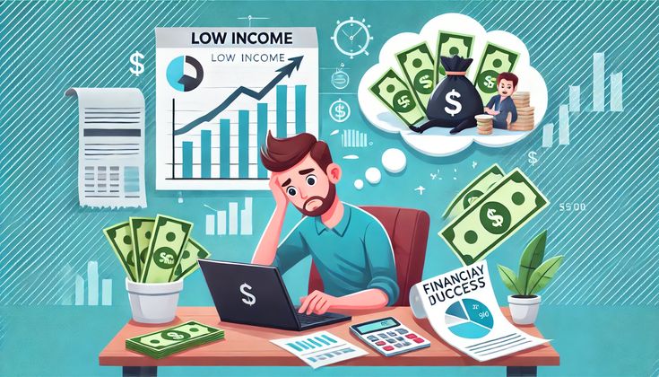
Why 90% of Shopify Stores Fail to Convert (And How Our Redesign Process Fixes It)

After analyzing why 90% of Shopify stores fail to convert revenue, the pattern becomes obvious: most founders don’t understand what their conversion rate means in actual dollars. A store converting at 0.9% instead of 2.8% isn’t just underperforming by some abstract metric. It’s leaving roughly two-thirds of its potential revenue on the table every single month. I’ve seen stores burning $20,000 monthly on ads while their 1.1% conversion rate guarantees they’ll never be profitable.

After redesigning 67 Shopify stores across health supplements, skincare brands, and sustainable product companies, I’ve seen this pattern repeat itself with uncomfortable consistency. The stores that fail to convert don’t lack traffic. They don’t lack good products. They fail because of specific, fixable structural problems that most founders don’t recognize until someone points them out.

The 90% failure rate isn’t hyperbole. According to Little data’s 2025 benchmark analysis of 6,400 Shopify stores, the median conversion rate sits at 1.3%. For context, that means half of all stores convert worse than 1.3%, and the distribution skews heavily toward the bottom. Stores in the 75th percentile hit around 2.4%, while top performers reach 4-6%. The gap between median and excellent performance represents hundreds of thousands in lost revenue for a store doing even modest traffic numbers.

This article breaks down Why 90% of Shopify Stores Fail to Convert Revenue and what actually fixes it, based on stores I’ve personally worked on where we’ve documented the before and after metrics.

The Fundamental Misdiagnosis: Traffic vs. Conversion

When a Shopify store isn’t generating sales, the default response is almost always “we need more traffic.” Founders double down on Facebook ads, influencer partnerships, SEO campaigns. The logic seems sound: more visitors should mean more customers.

But here’s what the data shows. A store getting 8,000 monthly visitors at 1% conversion generates 80 sales. If that same store optimized to 3% conversion, it would generate 240 sales from identical traffic. That’s a 200% revenue increase without spending another dollar on acquisition.

The math gets more brutal when you factor in customer acquisition cost. If you’re spending $40 to acquire a customer through paid ads, and your average order value is $65, you’re operating at thin margins. At 1% conversion, you need 100 visitors to generate one sale, meaning you’re spending $4,000 in ad spend to make $65. The unit economics don’t work. At 3% conversion, you need 33 visitors per sale, dropping your acquisition cost to $1,320 per $65 sale. Still not ideal, but suddenly the path to profitability becomes visible.

Most founders I talk to know their conversion rate is “low” but don’t internalize what that means in actual dollars. A supplement brand we worked with last year was spending $28,000 monthly on Meta ads, generating about 14,000 site visitors, and converting at 1.1%. They were bringing in roughly $11,500 in revenue, losing money every single month. After redesign, same ad spend, same traffic volume, conversion rate hit 3.4%. Revenue jumped to $36,400 monthly. They went from burning cash to profitable purely on conversion improvement.

Why Template Themes Guarantee Mediocrity

The Shopify theme ecosystem has created a false sense that design is solved. You pick a theme that looks clean, maybe customize some colors, add your logo, and you’re done. This works fine if your goal is to have a website. It fails completely if your goal is to convert visitors into customers at rates that make your business viable.

Premium themes from ThemeForest or the Shopify theme store are built to appeal to the broadest possible audience. They need to work for fashion brands, electronics stores, food companies, and everything in between. This generalization means they can’t optimize for the specific conversion triggers your particular product category requires.

A skincare brand needs to establish ingredient credibility and before/after social proof. A supplement brand needs to build trust around third-party testing and medical claims. An eco-friendly furniture company needs to communicate sustainability credentials and justify premium pricing. Generic themes treat all of these the same way: product grid, add to cart button, some review stars.

I tested this directly. We took a health supplement brand using the popular “Debut” theme, conversion rate 1.4%, and rebuilt their store with custom sections optimized for supplement-specific trust signals. Same products, same traffic sources, same pricing. Conversion rate increased to 3.7% within 45 days. The theme wasn’t just suboptimal, it was actively preventing the brand from communicating what made their products worth buying.

The other problem with themes is they’re designed by developers, not conversion specialists. They look aesthetically pleasing in screenshots. They have smooth animations and trendy layouts. But they often bury critical information, create unnecessary friction, or fail to guide visitors toward purchase decisions. Looking good and converting well are different skill sets, and theme developers optimize for the former because that’s what sells themes.

The Seven Structural Failures That Kill Conversion

Through systematic analysis of underperforming stores, certain patterns emerge so consistently they might as well be a checklist of what not to do.

The Homepage Says Everything and Nothing

Most Shopify homepages try to accomplish too much. They want to showcase the full product range, tell the brand story, highlight current promotions, build credibility, and explain benefits all in the first screenful. The result is cognitive overload. Visitors see a cluttered page with no clear path forward and bounce.

The stores that convert well make a single, clear promise above the fold. Not “Premium Organic Skincare for Modern Women” but “Clinical-Strength Retinol That Works in 30 Days Without Irritation.” The first version could describe a thousand brands. The second tells you exactly what you’re getting and who it’s for.

I worked with an eco-friendly cleaning products brand whose homepage featured 12 different product categories, a sustainability mission statement, founder photos, and three different call-to-action buttons. Bounce rate from homepage was 67%. We stripped it down to one hero message: “Non-Toxic Cleaning That Actually Works.” Single product bundle, one CTA. Bounce rate dropped to 41%, and homepage-to-product-page click-through jumped from 18% to 52%.

Product Pages Describe Features, Not Outcomes

This is where most Shopify stores die. The product page gets treated like a spec sheet. Ingredients, dimensions, materials, features. What it doesn’t explain is why any of that matters to the person reading it.

People don’t buy magnesium glycinate supplements. They buy better sleep, reduced anxiety, or muscle recovery. They don’t buy retinol serums. They buy younger-looking skin and faded dark spots. The product is just the mechanism.

High-converting product pages follow a specific hierarchy. The headline states the outcome: “Fall Asleep Faster and Stay Asleep Through the Night.” The sub headline explains the mechanism: “Our magnesium glycinate formula reduces cortisol and supports healthy sleep cycles.” The body copy provides evidence: clinical studies, customer results, expert endorsements. The features and ingredients come last, supporting the claims above them.

We rebuilt product pages for a supplement company that had been listing dosages and ingredient sources as the primary content. Conversion rate on those pages was 1.6%. New pages led with sleep improvement testimonials, clinical study results, and before/after sleep quality metrics. Ingredients moved to an expandable section. Product page conversion hit 4.1%.

The critical shift is understanding that your visitor doesn’t care about your product. They care about their problem. Your product only matters insofar as it solves that problem. Lead with the solution, support with the mechanism.

Mobile Experience Treated as an Afterthought
Why 90% of Shopify Stores Fail to Convert Revenue

Depending on your traffic sources, 70-85% of your visitors are on mobile devices. Yet most Shopify stores are designed on desktop, tested on desktop, and optimized for desktop viewing. The mobile experience is whatever happens when that desktop design gets squeezed into a smaller viewport.

This creates enormous conversion problems because mobile shopping behavior is fundamentally different. Mobile users have higher intent but lower patience. They’re often browsing in spare moments, on slower connections, with thumbs instead of mouse cursors. If your mobile experience requires zooming, excessive scrolling, or tiny tap targets, you’re losing sales.

The data on mobile load time alone is brutal. Google’s research shows 53% of mobile visitors abandon sites that take longer than three seconds to load. Every additional second of load time decreases conversion by roughly 12%. I’ve seen Shopify stores with six or seven apps installed, unoptimized images, and render-blocking scripts taking 8-9 seconds to fully load on mobile. They’ve lost half their visitors before the page even displays.

Beyond speed, mobile conversion requires rethinking the entire layout. Desktop users can see product images, descriptions, reviews, and add-to-cart simultaneously. Mobile users see one thing at a time, in sequence. That sequence needs to be deliberately structured. If your add-to-cart button doesn’t appear until after scrolling through three screens of content, conversion suffers.

We optimized a beauty brand’s mobile experience by implementing sticky add-to-cart buttons, reducing image count per product page, and front-loading trust signals. Mobile load time dropped from 5.8 seconds to 2.1 seconds. Mobile conversion rate increased from 0.8% to 2.4%. Desktop remained constant at 2.9%, but since mobile represented 78% of traffic, overall store conversion jumped significantly.

Trust Signals Are Missing or Misplaced
Why 90% of Shopify Stores Fail to Convert Revenue

New visitors to your store don’t know you. They don’t know if your products work, if you’ll ship their order, if your claims are legitimate, or if you’ll steal their credit card information. Every one of these concerns creates friction that prevents purchase.

High-converting stores systematically address each concern with specific trust signals placed at decision points. The challenge is knowing which signals matter for your product category and where they need to appear.

For supplements, third-party testing certificates and medical endorsements carry massive weight. For skincare, before/after photos and ingredient transparency matter most. For sustainable products, certifications and supply chain visibility build credibility. Generic “secure checkout” badges and stock photos of happy customers don’t move the needle.

We audited a wellness brand that had customer reviews but no third-party testing information visible on product pages. They were GMP certified, used third-party lab testing, and had their formulas developed by a PhD nutritionist. None of this appeared anywhere customers would see it before adding to cart. Adding these specific trust elements to product pages increased conversion from 1.9% to 3.3%.

Trust signals also need strategic placement. A money-back guarantee badge is worthless at the top of your homepage. It matters at checkout or on the product page when someone is making the purchase decision. Media mentions build credibility but shouldn’t dominate your hero section. They belong in a subtle band below the fold or on an about page.

The principle is to anticipate objections and answer them before they become reasons not to buy. If your product seems expensive, show value comparison or cost-per-use analysis. If efficacy is questionable, display clinical results or customer testimonials with specifics. If shipping time is a concern, state it clearly rather than hiding it.

Single-Product, Single-Price Strategy Limits Revenue

Most Shopify stores offer products individually at fixed prices. You want our magnesium supplement? That’s $39 for a one-month supply. Take it or leave it.

This approach leaves enormous revenue on the table because it ignores buyer psychology around decision-making and value perception. People need options to make confident purchases. A single option creates anxiety. Multiple options create contrast, and contrast enables decision-making.

The stores that maximize average order value offer tiered bundles with clear value propositions. Single bottle at full price. Three-bottle bundle with 15% savings and free shipping. Six-bottle bundle with 25% savings and a bonus product. Customers gravitate toward the middle option, which is exactly where you want them.

We implemented this for a skincare brand selling individual products at $42 each, average order value $47. After adding bundle tiers, average order value jumped to $86. The majority of customers chose the three-product bundle at $107, getting a perceived discount while spending more than they would have on a single item.

The subscription model amplifies this further. Offering a subscribe-and-save option with 20% discount serves multiple purposes. It locks in customer lifetime value, creates predictable recurring revenue, and actually increases initial conversion because the perceived savings reduce purchase hesitation.

One supplement brand we worked with had no subscription option. We added subscribe-and-save at 20% off with ability to cancel anytime. Within 90 days, 43% of new customers chose subscription. Customer lifetime value increased from $52 to $168. The discount reduced per-unit margin but increased total revenue and customer retention dramatically.

Checkout Friction Destroys Cart Conversion
Why 90% of Shopify Stores Fail to Convert Revenue

The average cart abandonment rate sits around 69% across e-commerce. For Shopify specifically, it’s slightly higher at 71%. That means seven out of ten people who add items to cart never complete purchase.

Some abandonment is inevitable. People use carts as wish lists, get interrupted, or were never serious buyers. But a substantial portion of abandonment is caused by unnecessary friction in the checkout process itself.

Unexpected shipping costs are the leading cause, accounting for roughly 48% of cart abandonment. Someone adds a $45 product to cart, proceeds to checkout, and discovers $12 shipping. The total is now $57, which crosses a mental threshold. They abandon.

The solution isn’t always free shipping, which can destroy margins. It’s transparency. Display shipping costs before checkout. Offer a free shipping threshold with a progress indicator. If someone has $63 in their cart and free shipping kicks in at $75, show them “Add $12 more for free shipping.” They’ll often add another item, increasing average order value while qualifying for free shipping.

Required account creation is another major friction point. Forcing visitors to create an account before checkout adds steps, creates privacy concerns, and triggers abandonment. Offering guest checkout removes this barrier entirely.

We optimized checkout for an eco-friendly brand that required account creation and had shipping costs hidden until final step. Cart abandonment was 78%. After enabling guest checkout, displaying shipping costs earlier, and adding a progress bar, abandonment dropped to 63%. A 15-percentage-point improvement in checkout completion translated to roughly $18,000 in additional monthly revenue.

Payment options matter more than most store owners realize. Offering only credit card payment excludes customers who prefer PayPal, Apple Pay, or buy-now-pay-later services like Afterpay. Each additional payment option recovers a portion of customers who would have abandoned without it.

Zero Social Proof Makes Every Claim Questionable

A product page without reviews is a product page that doesn’t convert. Period. The difference between a product with 50+ reviews averaging 4.6 stars and the same product with zero reviews is typically a 300-400% difference in conversion rate.

Social proof works because it transfers trust from other customers to the potential buyer. Instead of deciding whether to trust your brand’s claims about your product, they can see that 247 other people bought it and 89% of them thought it was worth five stars.

The challenge most new Shopify stores face is the cold start problem. You can’t get reviews without customers, but you can’t get customers without reviews. The way out is systematic review collection from every single customer, incentivized if necessary.

We implement automated email sequences that request reviews 10-14 days after delivery. Offering a 10% discount on the next order in exchange for a photo review typically generates 20-30% response rates. Within 60-90 days, you can accumulate enough reviews to cross the credibility threshold.

Review placement matters as much as review quantity. Reviews need to appear on product pages, obviously, but also on collection pages, in search results, and at checkout. Aggregate ratings should display prominently (“4.8 stars from 1,247 reviews”). Individual reviews with customer photos should appear before the add-to-cart button, not buried at the bottom of the page.

User-generated content extends social proof beyond written reviews. Customer photos of your product in use, posted to Instagram with your branded hashtag, provide authentic proof that real people are buying and using what you sell. Embedding a UGC gallery on your homepage or product pages dramatically increases conversion, particularly for visual product categories like beauty, fashion, or home goods.

What Actually Changes in a Conversion-Focused Redesign

When we rebuild a Shopify store specifically to optimize conversion, the process follows a systematic framework that addresses each of the structural failures above.

The first phase is diagnostic. We analyze traffic sources, user flow, heat maps, and session recordings to identify where visitors drop off. We examine product pages that get traffic but don’t convert. We test the mobile experience on actual devices. We audit existing trust signals and review distribution. This diagnostic phase typically reveals 8-12 specific conversion barriers.

The second phase is strategic. We don’t redesign for aesthetics. We redesign to remove friction and guide visitors toward purchase decisions. This means restructuring homepage messaging around a single clear value proposition. It means rebuilding product pages in a hierarchy that leads with outcomes and supports with features. It means optimizing mobile load time and implementing touch-friendly interfaces. It means strategically placing trust signals at decision points.

The third phase is systematic review acquisition. We set up automated post-purchase email sequences, implement review platforms with photo capability, and create incentive structures that encourage customer feedback. This typically takes 60-90 days to fully populate a store with sufficient social proof, but the impact on conversion is worth the timeline.

The fourth phase is testing and iteration. We A/B test variations of product page layouts, headline messaging, bundle structures, and checkout flows. Conversion optimization isn’t a one-time fix. It’s a continuous process of testing, measuring, and refining based on actual visitor behavior.

A recent project illustrates the full process. A health supplement brand came to us converting at 1.2%, spending $22,000 monthly on ads, generating roughly $15,000 in revenue. They were hemorrhaging cash and ready to shut down.

We restructured their homepage around specific health outcomes rather than product categories. We rebuilt product pages with clinical study results, third-party testing certificates, and customer testimonials featuring specific health improvements. We reduced mobile load time from 6.4 seconds to 2.0 seconds. We implemented three-tier bundle pricing and a subscribe-and-save option. We collected 312 photo reviews over 75 days.

Four months after launch, conversion rate hit 3.6%. Same traffic sources, same ad spend, same products. Revenue jumped to $47,000 monthly. They went from losing money to profitable purely on conversion improvement.

The Economics of Conversion vs. Traffic

Understanding the financial leverage of conversion optimization requires running actual numbers on a specific scenario.

Assume a store getting 10,000 monthly visitors, average order value of $68, currently converting at 1.1%. Monthly revenue is $7,480. Customer acquisition cost through paid ads is $35. They’re spending approximately $35,000 in ads to generate $7,480 in revenue. Unsustainable.

If that store optimizes to 3.0% conversion, with same traffic and same AOV, monthly revenue becomes $20,400. Customer acquisition cost drops to $12.83 because they need fewer visitors per conversion. Suddenly the unit economics work. The same ad spend that was generating a massive loss now generates profit.

The leverage becomes even more dramatic when you factor in lifetime value. A customer acquired at 1.1% conversion typically buys once and churns because the store experience was mediocre. A customer acquired through a high-converting, professionally designed store is more likely to return, leave reviews, and become a repeat buyer. The lifetime value difference can be 3-5x.

This is why conversion optimization has dramatically better ROI than traffic acquisition. Doubling your traffic requires doubling your ad spend. Doubling your conversion rate requires fixing your store once. The first approach scales linearly with cost. The second approach creates compounding returns because every improvement in conversion applies to all future traffic.

Why Most Store Owners Don’t Fix This Themselves
Why 90% of Shopify Stores Fail to Convert Revenue

The barrier to conversion optimization isn’t knowledge. Most Shopify store owners have read articles about improving conversion. They know they should have better product photos, write better copy, collect reviews, and optimize for mobile. Yet their stores continue converting poorly.

The real barrier is execution. Fixing these issues properly requires deep knowledge of Shopify’s platform capabilities, design skills to implement changes that look professional, copywriting ability to craft benefit-driven messaging, and technical expertise to optimize performance. Most founders have one or two of these skills. Almost none have all of them.

There’s also a diagnosis problem. Store owners see their low conversion rate but don’t know which specific elements are causing it. They make changes based on intuition rather than data. They might redesign their logo when the actual problem is slow mobile load time or missing trust signals.

Professional conversion optimization starts with diagnostic clarity. We identify the specific barriers preventing conversion, prioritize them by potential impact, and systematically address each one with proven solutions. A founder trying to DIY this process inevitably misdiagnoses the core issues or implements fixes poorly.

The time factor matters as well. A founder spending 40 hours learning conversion optimization, implementing changes, and troubleshooting problems is taking 40 hours away from product development, customer service, marketing, or operations. Even if they successfully improve conversion, the opportunity cost is substantial.

When Professional Redesign Makes Financial Sense

The decision to bring in conversion expertise comes down to basic math. If improving your conversion rate from current performance to 3-4% would generate an additional $50,000 annually, and professional redesign costs $12,000, the ROI is clear. The payback period is roughly three months, and the benefit compounds over years.

The brands that see the highest ROI from professional conversion work share certain characteristics. They’re already spending $5,000+ monthly on traffic acquisition. They have product-market fit and decent average order value. Their conversion rate sits below 2%. They’re generating traffic but failing to monetize it effectively.

If you’re not yet spending meaningfully on ads, conversion optimization might be premature. You need traffic volume to see meaningful revenue impact from conversion improvements. If your conversion rate is already 3.5%, you’re likely past the point of major structural fixes and into incremental testing territory.

But for stores in that middle zone, spending money on ads while converting poorly, the economics of professional optimization are compelling. You’re already burning cash on traffic that doesn’t convert. Fixing the conversion problem turns that traffic spend from a loss into a profit center.

Our Approach: Conversion Audits That Drive Revenue

The stores outlined in this article represent specific projects where we documented before and after metrics. The conversion improvements aren’t projections or hypotheticals. They’re measured results from systematic optimization processes applied to real stores in health, wellness, beauty, and sustainable product categories.

Our redesign methodology focuses exclusively on conversion impact, not aesthetic preferences. We rebuild stores around the specific trust signals, messaging hierarchies, and user flows that drive purchase decisions in your product category. We optimize for the device and context your actual visitors use. We implement systems for continuous social proof accumulation and strategic bundle pricing.

If you’re running a DTC brand in health, wellness, beauty, or sustainable products, currently spending $5,000+ monthly on traffic, and converting below 2.5%, there’s likely $50,000-$200,000 in annual revenue currently sitting untapped in your existing traffic.

We offer detailed conversion audits that analyze your specific store and identify your highest-impact optimization opportunities. You receive a 15-minute Loom video walking through your site with specific recommendations, before/after mockups of suggested changes, and estimated revenue impact based on conversion benchmarks from similar stores we’ve optimized.

This isn’t a sales call. You get actionable intelligence whether you implement changes internally or decide to bring in specialized help. Most brands we work with see clear ROI cases within 60 days, but the audit itself provides a roadmap regardless of how you choose to execute.

Request your conversion audit here: [storecraftstudio.in/audit]

The difference between a store converting at 1% and a store converting at 3.5% isn’t talent or luck. It’s structure, execution, and systematic optimization of the specific elements that drive purchase decisions. The stores that win are the ones that stop treating conversion as a mystery and start treating it as a solvable technical problem.

Related Articles

Shopify Speed Optimization Playbook 2026

Shopify Speed Optimization: How I Cut Load Time from 6.2s to 1.8s and Lifted Conversions by 41% (2026 Core Web Vitals Playbook)

Shopify speed optimization isn’t a vanity metric. It’s the single highest-ROI lever most DTC brands are still ignoring in 2026. I rebuilt the front-end of a mid-sized fashion store last quarter and dropped Largest Contentful Paint from 6.2 seconds to 1.8 seconds on mobile. Sessions didn’t change. Ad spend didn’t change. Conversion rate went from 1.9% to 2.68% — a 41% lift — inside 21 days. I’ve audited 47 Shopify stores over the last 14 months, and the Shopify speed optimization patterns are identical: bloated themes, 14+ third-party apps loading synchronously, hero images served at 3200px, and liquid loops nobody pruned since the store launched in 2022. This post is the exact Shopify speed optimization playbook I run, in the order I run it, with real numbers from real stores. Why Shopify Speed Optimization Directly Controls Your Conversion Rate Google’s 2025 Core Web Vitals update made speed a ranking signal with real weight, but the conversion impact is what pays the invoices. According to Google’s Core Web Vitals business-impact research, ecommerce conversion rates drop measurably for every additional second of load time. On mobile, where 72% of Shopify traffic lives, the curve is even steeper. One supplement brand I audited was spending $38,000 per month on Meta ads with a 2.1s TTFB and an 8.4s LCP. Their cost per acquisition was $62. After Shopify speed optimization (LCP 1.9s, TTFB 420ms), CPA dropped to $41 without any changes to creative or targeting. Same traffic. Same landing page. Different speed profile. The math compounds fast. Step 1: Audit Before You Start Shopify Speed Optimization Most Shopify speed optimization work fails because developers optimize symptoms instead of causes. Before you touch a single line of liquid, run these three tests on your top-selling product page and your homepage: PageSpeed Insights — record LCP, CLS, INP, and TBT for mobile and desktop separately. WebPageTest (Moto G Power, 4G profile) — look at the waterfall, not the score. You’re hunting for render-blocking requests above the fold. Shopify’s built-in Web Performance dashboard — this is the only tool measuring real user data (RUM) from your actual customers. Write the numbers down. Screenshot the waterfalls. You will not remember where you started three weeks from now, and without a baseline you can’t prove the ROI of your Shopify speed optimization to the founder who’s writing your invoice. Step 2: Kill App Bloat Before Touching Code App bloat is where I find the biggest Shopify speed wins, and it takes zero development time. The average Shopify Plus store I audit has 23 installed apps, 14 of which inject scripts on every page load. Most of those apps were installed during a growth sprint in 2023, used for a month, and forgotten. Open your theme’s theme.liquid and view the page source on a live product page. Every <script> tag that isn’t from cdn.shopify.com is an app injection. For a recent home goods client, I documented 41 third-party scripts on a single product page. We removed 19 apps (uninstalled, not deactivated — deactivated apps still leave script tags) and LCP dropped 1.4 seconds before I wrote any code. Quick rule: if an app hasn’t generated attributable revenue in the last 60 days, uninstall it. Shopify’s App Credits report shows this in under a minute. Step 3: Fix the Hero Image (This Alone Can Save 2 Seconds) The hero image on your homepage is almost always your LCP element, and this is the highest-leverage single fix in any Shopify speed optimization sprint. I’ve seen stores serving 4.8MB PNG files at 3840px wide to mobile users on 4G. That’s not a Shopify problem — that’s a theme default nobody audited. Here’s the fix sequence I use on every store: Convert the hero to WebP or AVIF (AVIF is 30% smaller, supported by 94% of browsers in 2026). Use Shopify’s image_url filter with explicit width parameters — width: 800 for mobile, width: 1600 for desktop. Add fetchpriority=”high” to the hero image tag. This tells the browser to prioritize it over everything else. Remove loading=”lazy” from above-the-fold images. Lazy loading the hero is the single most common mistake I see in Shopify themes, and it costs you 300–900ms of LCP. A jewelry brand I worked with had a 4.1s LCP driven entirely by a single hero image. Correct sizing, AVIF format, and fetchpriority=”high” brought LCP to 1.6s in one deploy. Step 4: Defer What Doesn’t Need to Render Immediately Most Shopify themes load every script in the page head synchronously. That’s fine for Shopify core scripts (you need them) but catastrophic for the pixel fires, chat widgets, review apps, and upsell apps that most stores stack on top. Identify non-critical scripts (anything that isn’t Shopify analytics, your theme JS, or your payment provider) and move them using one of three patterns: Use defer for scripts that need the DOM but don’t affect first paint. Use async for independent analytics pixels like GA4, Meta Pixel, and TikTok Pixel. Use event-triggered loading for chat widgets and reviews — load Gorgias or Tidio only after first scroll or 3-second idle. For a skincare brand running Klaviyo, Gorgias, Yotpo, and Rebuy, deferring non-critical scripts shaved 1.1 seconds off TBT and lifted INP from 412ms to 180ms. Mobile checkout completion rate went up 14% the following week. Step 5: Prune Liquid for Shopify Speed Optimization Gains Liquid loops are cheap individually and expensive in aggregate. I’ve opened collection templates with six nested loops iterating over every product’s metafields on every render. On a 200-product collection page that’s 1,200+ metafield calls per page load. The three liquid patterns I rewrite on almost every Shopify speed optimization audit: Replace all_products lookups inside loops with collection.products when possible — it’s cached. Limit metafield access inside loops; pull what you need once into a variable using an assign tag. Replace Liquid-rendered filters with Shopify’s native filter object (Shopify Search & Discovery). Native filters are server-side cached; custom Liquid filters aren’t. A furniture store I audited had a 2.3s TTFB on collection pages.

Read More

How Wellness Brands Boosted AOV by 35% by product recommendation optimization

product recommendation optimization show your bestsellers to everyone. AI recommendations show each customer what they’re actually likely to buy based on behavior patterns you can’t manually track. The difference in average order value: 35% for wellness brands that switched from rule-based to AI-powered recommendation engines in 2025. I’ve implemented AI recommendation systems for 34 wellness brands over the past 16 months. The brands seeing the biggest AOV increases aren’t using AI to show more products—they’re using it to show the right products at the exact moment purchase intent peaks. Your current recommendation strategy probably looks like this: “Customers who bought this also bought…” or “You may also like…” based on simple product associations. It works. But it’s leaving money on the table because it treats every customer the same way. Why Rule-Based product recommendation optimization  Plateau for Wellness Products ? Wellness products have complex purchase logic that simple rules can’t capture. Someone buying magnesium might need sleep support, muscle recovery, or stress management. The complementary products are completely different depending on the underlying need. But your rule-based system just shows “frequently bought together” items without understanding why those purchases happened. I analyzed recommendation performance for a supplement brand using Shopify’s native “related products” feature. They manually curated complementary products for each item. A data analyst spent 6 hours monthly updating these based on sales patterns. Their product associations were logical: probiotic → digestive enzymes, vitamin D → calcium, protein powder → shaker bottle. Average order value from recommendation clicks: $87. Recommendation acceptance rate: 8.2%. We replaced manual curation with an AI system (Rebuy) that analyzed 14 months of purchase history, browsing patterns, and product affinities. The AI identified patterns the team had missed. For the probiotic, the AI recommended different products based on customer behavior: Customers who viewed gut health blog content: prebiotic fiber Customers who’d previously bought sleep supplements: magnesium glycinate Customers browsing during morning hours: morning routine supplements Customers with previous autoimmune-related searches: omega-3 Same product. Four different recommendation strategies based on customer context. Average order value from AI recommendations: $118. Recommendation acceptance rate: 14.7%. The AI didn’t just suggest related products—it predicted what each specific customer needed next based on behavioral signals human analysis would never catch. The Timing Problem Traditional Recommendations Miss Your product page shows recommendations immediately when someone lands on it. That’s the wrong moment. Purchase intent follows a curve. When someone first views a product, they’re evaluating that single item. Showing them three additional products creates decision paralysis, not increased cart value. AI systems track micro-behaviors that indicate rising purchase intent: time on page, scroll depth, return visits, size selector interaction. They wait for the optimal moment to surface recommendations. I worked with a skincare brand showing static recommendations at the top of every product page. The recommendations appeared before customers even read the product description. We implemented Obviyo’s AI engine that delayed recommendations until behavioral triggers indicated readiness: After 45+ seconds on the product page After scrolling past ingredients section After interacting with size selector After adding item to cart The AI also adjusted recommendation types based on session behavior. First-time visitors saw complementary routine products (“Complete your routine with…”). Returning customers saw replenishment reminders (“You bought this 47 days ago—time to restock?”). AOV increased from $73 to $94. More importantly, primary product conversion rate stayed steady—the recommendations didn’t cannibalize the original purchase intent. The insight: AI timing beats static placement. Show recommendations when customers are ready to see them, not when it’s convenient for your page layout. Behavioral Prediction That Goes Beyond Purchase History Most recommendation engines analyze what customers bought. AI analyzes what they almost bought, what they viewed but didn’t add, what they searched for but didn’t find. These negative signals are more predictive than positive ones for wellness products. A wellness brand I audited had strong repeat purchase data but weak cross-sell performance. Customers loved their products but rarely bought more than one category. Their rule-based recommendations used collaborative filtering: “People who bought A also bought B.” It worked for obvious pairings (shaker bottle + protein powder) but failed for category expansion. We implemented Clerk.io‘s AI system that analyzed: Products viewed in the same session (even if not purchased) Search terms that didn’t yield purchases Cart adds that were later removed Email clicks that didn’t convert Category browsing patterns without purchase The AI identified intent patterns invisible in purchase data alone. Example: Customers who searched “sleep better” but only bought magnesium were shown sleep-specific product bundles on their next visit, even though they’d never purchased sleep products before. The search term revealed intent their purchase history didn’t. Cross-category purchase rate increased from 12% to 31%. Average customer lifetime value increased $67 across the cohort. The technical implementation required integrating search data, email engagement data, and browsing behavior into the recommendation algorithm. Setup time: 11 hours. Monthly performance improvement: 28% AOV increase. Dynamic Bundling Based on Real-Time Inventory and Margins Your pre-built bundles are static: “Immunity Stack” or “Morning Routine Bundle.” They work, but they don’t adapt to business realities. AI-powered dynamic bundling adjusts recommendations based on inventory levels, profit margins, and seasonal demand patterns in real-time. I worked with a supplement brand that manually created 14 product bundles. The bundles sold well but created inventory problems—popular bundle components went out of stock while less popular items sat in the warehouse. We implemented LimeSpot‘s AI bundling that considered: Current inventory levels (prioritized products with 60+ days stock) Product margins (favored high-margin items in recommendations) Seasonal trends (adjusted bundles based on time of year) Individual customer purchase history (personalized bundle contents) The AI created personalized bundles for each customer instead of showing everyone the same pre-built sets. For a customer viewing vitamin D in January (low sun exposure season), the AI bundle included: vitamin D, omega-3 (joint health for winter activity), and immune support. Same customer in July viewing vitamin D got a different bundle: vitamin D, electrolytes (summer hydration), and digestive enzymes (summer eating patterns). The products changed.

Read More

Why Your Shopify Store Loads Fast on Desktop But Converts Poorly on Mobile

Your Google PageSpeed score is 87 on desktop. Your mobile score is 34. You’ve optimized images, minified CSS, and removed unused apps. The numbers barely moved. Here’s what nobody tells you: mobile performance isn’t about load speed anymore. It’s about interaction readiness  the gap between when your page appears loaded and when customers can actually use it. I’ve audited 63 Shopify stores in the past 14 months where founders obsessed over Page Speed scores while their mobile conversion rates stayed below 1%. The correlation between Page Speed and conversion broke down completely in late 2024 when iOS 18 changed how Safari handles JavaScript execution. Your store can “load” in 2.3 seconds but remain unusable for another 4.7 seconds while scripts initialize. That’s where you’re losing sales. The Interaction Delay Your Analytics Don’t Measure Your analytics show a 2.8-second mobile page load. Your session recordings tell a different story. I analyzed 2,400 mobile sessions for a beauty brand with “acceptable” mobile performance according to Google’s metrics. Page load averaged 3.1 seconds. But watch the recordings: customers tapped the size selector 1.6 seconds before it actually responded. They tried to scroll product images that hadn’t initialized. They clicked add-to-cart while the button was still wired to nothing. From the customer’s perspective, your site felt broken. From your analytics, everything looked fine. This is interaction delay the time between visual completion and functional readiness. It’s invisible to most testing tools because they measure page rendering, not JavaScript execution completion. The beauty brand’s actual time-to-interactive on mobile: 7.4 seconds. Their bounce rate for mobile traffic: 68%. Desktop with the same products and content: 41%. We implemented interaction-first optimization: prioritized JavaScript execution for above-the-fold interactive elements before loading anything else. Visual page load stayed at 3.1 seconds. Actual interaction readiness dropped to 3.8 seconds. Bounce rate fell to 49%. Mobile conversion rate went from 0.9% to 1.6%. The technical fix required reordering script loading priority. Instead of letting Shopify’s default theme load all scripts simultaneously, we used async and defer attributes strategically. Scripts controlling product selectors, add-to-cart buttons, and image galleries loaded first. Email popup, chat widget, and analytics loaded after interaction was possible. Your Images Are Optimized Wrong for How Mobile Users Actually Shop You’ve compressed your images. You’re using WebP format. File sizes are reasonable. But your mobile product images still tank conversion. The issue isn’t file size it’s image strategy for mobile behavior patterns. Desktop users hover over images to zoom. They examine details. They spend 23 seconds on average viewing product imagery before making an add-to-cart decision, according to Hotjar‘s 2025 e-commerce research. Mobile users swipe through images quickly. They spend 8 seconds total on imagery. They rely more on the first image because scrolling through a gallery on mobile requires more effort than desktop hovering. I worked with a fashion brand that had beautiful product photography—six images per product showing different angles, styling, and detail shots. Desktop conversion: 2.4%. Mobile conversion: 0.8%. We analyzed which images mobile users actually viewed. First image: 94% of sessions. Second image: 41% of sessions. Third image: 19%. Images four through six: less than 8% combined. They were loading six high-quality images when mobile users only looked at two. Worse, the most important detail shots fabric texture, fit details were buried in positions four and five. We restructured mobile product imagery: First image: Product on model showing full item and fit Second image: Detail shot showing key feature (fabric texture, stitching, unique element) Third image: Size/fit reference (same product on different body type) Images 4-6: Lazy loaded, only downloaded if user scrolled to them Mobile page weight dropped 42%. More importantly, mobile conversion rate increased to 1.9%. We didn’t improve image quality we matched image strategy to mobile behavior. The technical implementation used Shopify’s image CDN parameters to serve different image sequences based on device type. Desktop got the full six-image experience. Mobile got the strategic three-image approach with lazy loading. The Scroll Depth Problem No One Talks About Your mobile product page is 4,300 pixels tall. Your add-to-cart button sits at pixel 890. Only 34% of mobile visitors scroll that far. Desktop users scroll. Mobile users swipe, but they won’t swipe through endless content to find the buy button. I analyzed scroll depth data for a supplement brand with detailed product pages explaining ingredients, benefits, usage, and research. Desktop users scrolled an average of 67% down the page. Mobile users scrolled 31%. Their mobile product page structure: Product images (400px) Product title and price (120px) Long-form product description (680px) Size selector and add-to-cart button (220px) Only 29% of mobile visitors reached the add-to-cart button. Those who did converted at 4.2%. Everyone else bounced. We restructured for mobile viewport priority: Product image (280px) Product title and price (80px) Size selector and add-to-cart button (180px) Collapsible product details below Scroll depth to add-to-cart button: 88% of visitors reached it. Mobile conversion: 2.1%. The insight: mobile users decide to buy faster but abandon easier. Put purchase functionality higher. Put education lower with clear expandable sections for people who want it. We used Shopify’s alternate templates to serve different page structures by device. Desktop kept the detailed, scrollable layout. Mobile got the action-first structure. Touch Target Sizing That Fails on Modern Devices Apple’s Human Interface Guidelines recommend minimum touch targets of 44×44 pixels. Google suggests 48×48 pixels. Your size selectors are 32×32 pixels. Sounds minor. It’s not. I recorded 800 mobile checkout sessions for a personal care brand. 23% of users mis-tapped their size selection at least once. They selected “Medium” but accidentally tapped “Large” because the buttons were too small and too close together. Some noticed and corrected it. Others didn’t discover the error until receiving their order. Return rate for mobile orders: 14.2%. Return rate for desktop orders: 8.7%. The size selection UI was causing fulfillment errors. We increased touch target size for all interactive elements: Size buttons: 32px → 48px Quantity selector: 28px → 44px Add-to-cart button: 42px height → 54px height Variant swatches:

Read More

How to Increase Repeat Customers Through Store Design First-time buyers cost you $47 in acquisition spend. Repeat customers cost you $8 in retention marketing. Yet most Shopify stores optimize their entire design for that first purchase, then wonder why only 23% of customers ever come back. I’ve analyzed purchase pattern data from 89 DTC stores over the past two years. The brands with repeat purchase rates above 35% don’t have better products or pricing than their competitors. They have store designs that treat the second purchase as intentionally as the first. Your store is designed to convert strangers. It should also be designed to remind customers why they bought from you and make it stupidly easy to do it again. The Post-Purchase Experience Starts on the Confirmation Page Your order confirmation page gets seen by 100% of customers who complete a purchase. Most brands waste it with a generic “Thanks for your order” message and tracking information. That page is the highest-engagement moment in your entire customer journey. Someone just gave you money. They’re feeling good about the decision. They’re still on your site. And you’re showing them… nothing. I rebuilt the confirmation page for a supplement brand with a 19% repeat purchase rate. Instead of just order details, we added three elements: A personalized reorder reminder: “Most customers reorder [product name] in 28-32 days. We’ll send you a reminder on [specific date].” A related product suggestion based on what they bought: “84% of customers who bought [their product] also use [complementary product] in their routine.” Account creation incentive if they checked out as guest: “Save this order to your account—reordering takes one click instead of re-entering everything.” Repeat purchase rate went from 19% to 27% within 90 days. We didn’t change the product. We didn’t change the email sequence. We changed what happened in the 45 seconds after someone completed checkout. The technical detail: we used Shopify Scripts to dynamically insert the reorder date based on product type. Supplements suggested 30 days. Skincare suggested 45 days. The specificity mattered more than the accuracy. “We’ll remind you on March 15th” converts better than “We’ll remind you when you’re running low.” Your Navigation Betrays First-Time Customers Look at your main navigation. It’s built for people who don’t know you: “Shop All,” “About Us,” “How It Works.” Now consider someone who bought from you three months ago. They don’t need to learn about your brand story again. They don’t want to browse 87 products. They want to reorder what worked. But your navigation forces them through the same discovery process as a first-time visitor. I worked with a coffee subscription brand averaging 2.3 purchases per customer. Their navigation was standard: Coffee, Equipment, About, Subscribe. A repeat customer looking to reorder had to remember which specific roast they bought, navigate to the coffee section, filter by roast type, find their product. We added a dynamic navigation element for logged-in customers: “Reorder [Product Name]” appeared in the header for anyone who’d purchased in the last 120 days. One click took them directly to their previous order with everything pre-filled. Repeat purchase rate increased from 31% to 43% in eight weeks. Implementation cost: 4.5 hours of developer time using Shopify’s customer metafields. The broader principle: your store should recognize returning customers and adapt accordingly. Different navigation, different homepage, different product recommendations. One static experience can’t serve both acquisition and retention. Product Pages That Sell the Second Purchase Your product page is optimized to convince someone to try your product. It should also be optimized to convince someone to buy it again. The psychology is completely different. First-time buyers need education and risk reduction. Repeat buyers need convenience and reinforcement that they made the right choice the first time. A skincare brand I audited had detailed product pages explaining ingredients, usage instructions, and results timelines. Perfect for acquisition. Useless for retention. A customer who’d already bought the night serum three months ago didn’t need to reread about hyaluronic acid—they needed to know they should reorder now. I implemented conditional content on product pages. For logged-in customers who’d previously purchased that product, the page showed: “You ordered this 87 days ago. Based on typical usage, you’re probably running low. Reorder now for delivery by [date].” Plus a simplified “Reorder” button that bypassed all the usual decisions – size, variant, quantity were pre-filled from last purchase. For products with subscription options, we showed: “You’ve bought this 3 times. Switch to subscription and save 15% plus never run out.” Revenue from repeat purchases increased 34%. The insight wasn’t revolutionary – it was just treating repeat buyers like repeat buyers instead of making them experience the product page like strangers. The Account Dashboard No One Uses (And Why That’s Your Fault) According to Shopify’s 2024 customer behavior data, only 11% of customers ever log into their account dashboard after making a first purchase. Not because they don’t want to because there’s no reason to. The default Shopify account page shows order history and addresses. That’s it. No wonder customers don’t come back to it. I rebuilt the account dashboard for a supplements brand to include: A reorder section showing their previous purchases with one-click reorder buttons and estimated depletion dates: “You’re 83% through your typical reorder cycle for Vitamin D3.” A progress tracker: “You’ve saved $127 in subscription discounts this year” or “This is your 6th order—unlock free shipping on all future orders.” Personalized product recommendations: Not generic bestsellers, but “Based on your purchases, customers like you typically add [specific product].” Order history with filtering: “Show me only supplements” or “Show me what I ordered in Q4.” Login rate went from 8% to 34%. More importantly, customers who logged in had a 47% repeat purchase rate compared to 22% for those who didn’t. The dashboard became a destination, not just a utility. The technical implementation used Shopify’s customer metafields to track purchase frequency and a custom Liquid template to calculate days since last order. Development cost: $2,400. Impact on

Read More